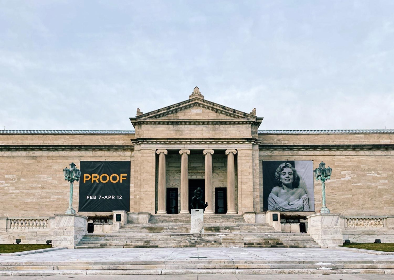
From the moment Cleveland Museum of Art Director Bill Griswold first saw the contact sheets in Mark Schwartz and Bettina Katz’s photography collection, he envisioned an exhibition. The resulting collaboration between the museum, former MoMA Chief Curator of Photography Peter Galassi, and N+S, which included an exhibition opened at CMA in 2020, identity materials, and exhibition book, highlighted the contact sheet’s ability to tell a story, and established it as an art object.
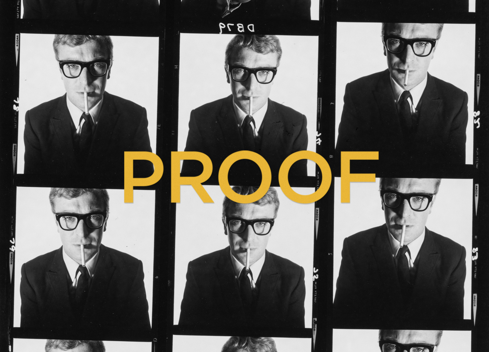
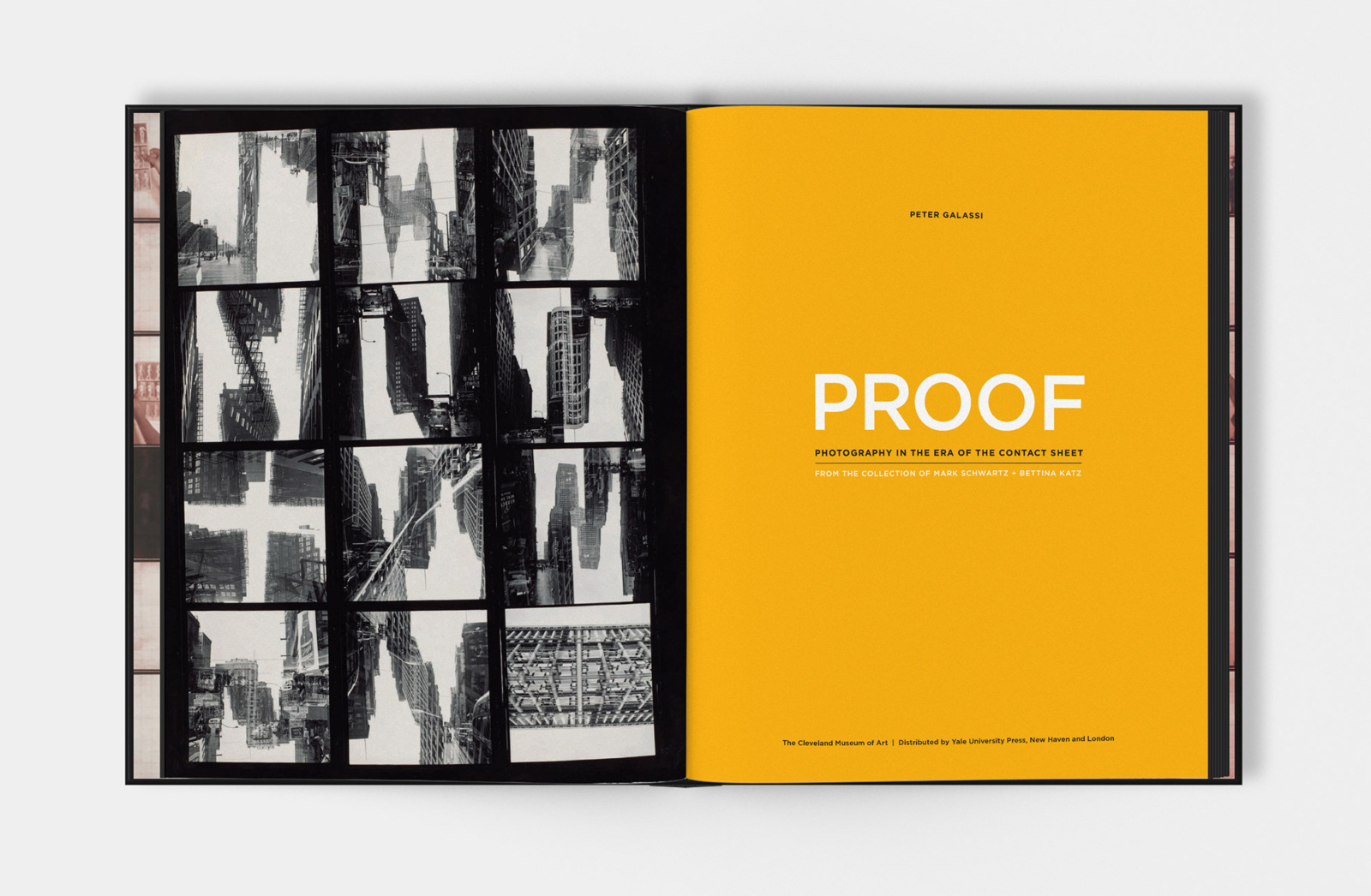
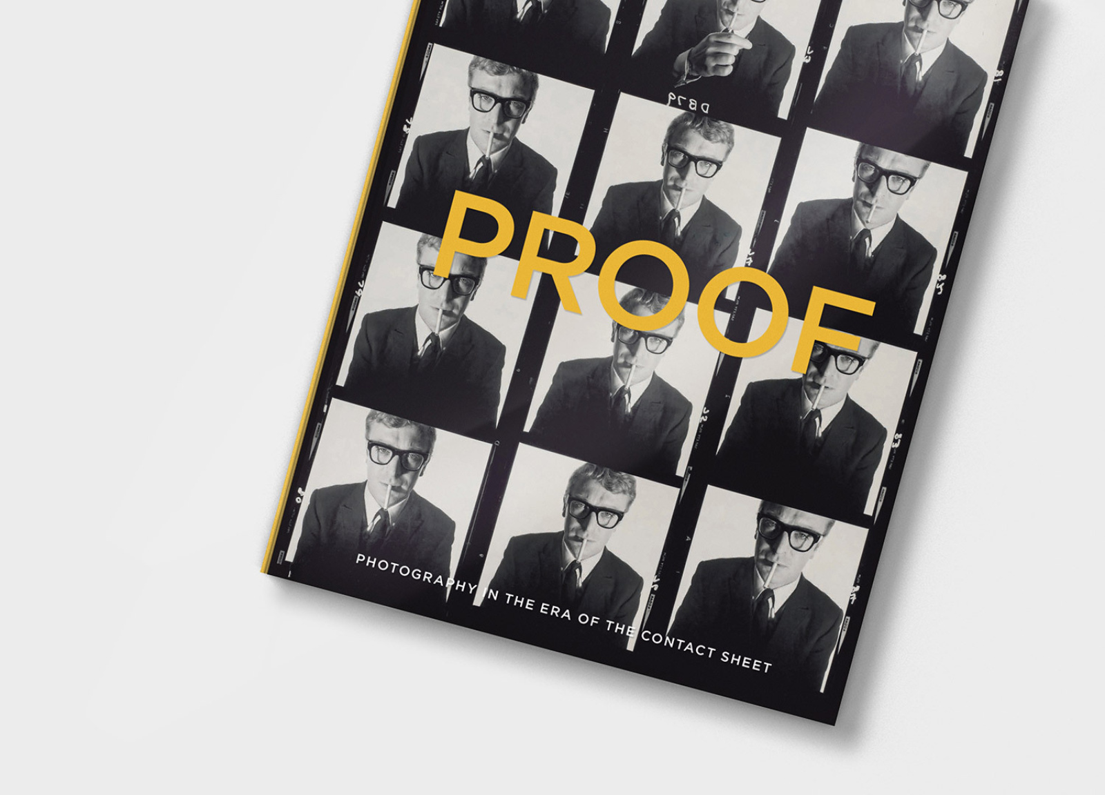
PROOF is unique among exhibition books. The design nods to twentieth-century film photography, and features full-bleed images of contact sheets that emphasize their role in the editing and curation process. The book design balances larger spreads against individual prints, emphasizing clean, open design that encourages readers to lean in and examine the details of the images. It invites readers of all ages and vocations to engage with twentieth century photography, and embodies important insights and stories that live at the intersection of the fine arts and popular culture.
The Work
Our late founder Mark Schwartz and our president Bettina Katz’s photography collection shifted focus to the acquisition of contact sheets in the early 2000s. From the moment Cleveland Museum of Art Director Bill Griswold first saw these images, he envisioned an exhibition.

The resulting exhibition is a true collaboration between museum, curator, and design firm. Organized by CMA, curated by the Museum of Modern Art’s former Chief Curator of Photography Peter Galassi, and designed by N+S, it not only highlights the contact sheet’s ability to tell a story, but also establishes the sheet as an art object in and of itself.
We designed the signature identity that drives the exhibition book design and the exhibition itself. The identity is present in all applications, including banners, event materials, and promotional items.
The Results
PROOF, written by Galassi and published by the Yale University Press, is unique among exhibition books. Elements of the book design are specific nods to twentieth-century film photography, including the identity’s color palette, which is driven by a bold yellow inspired by the Kodak brand.
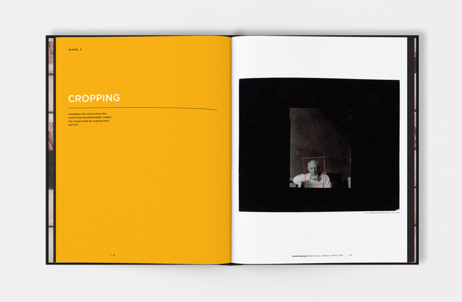
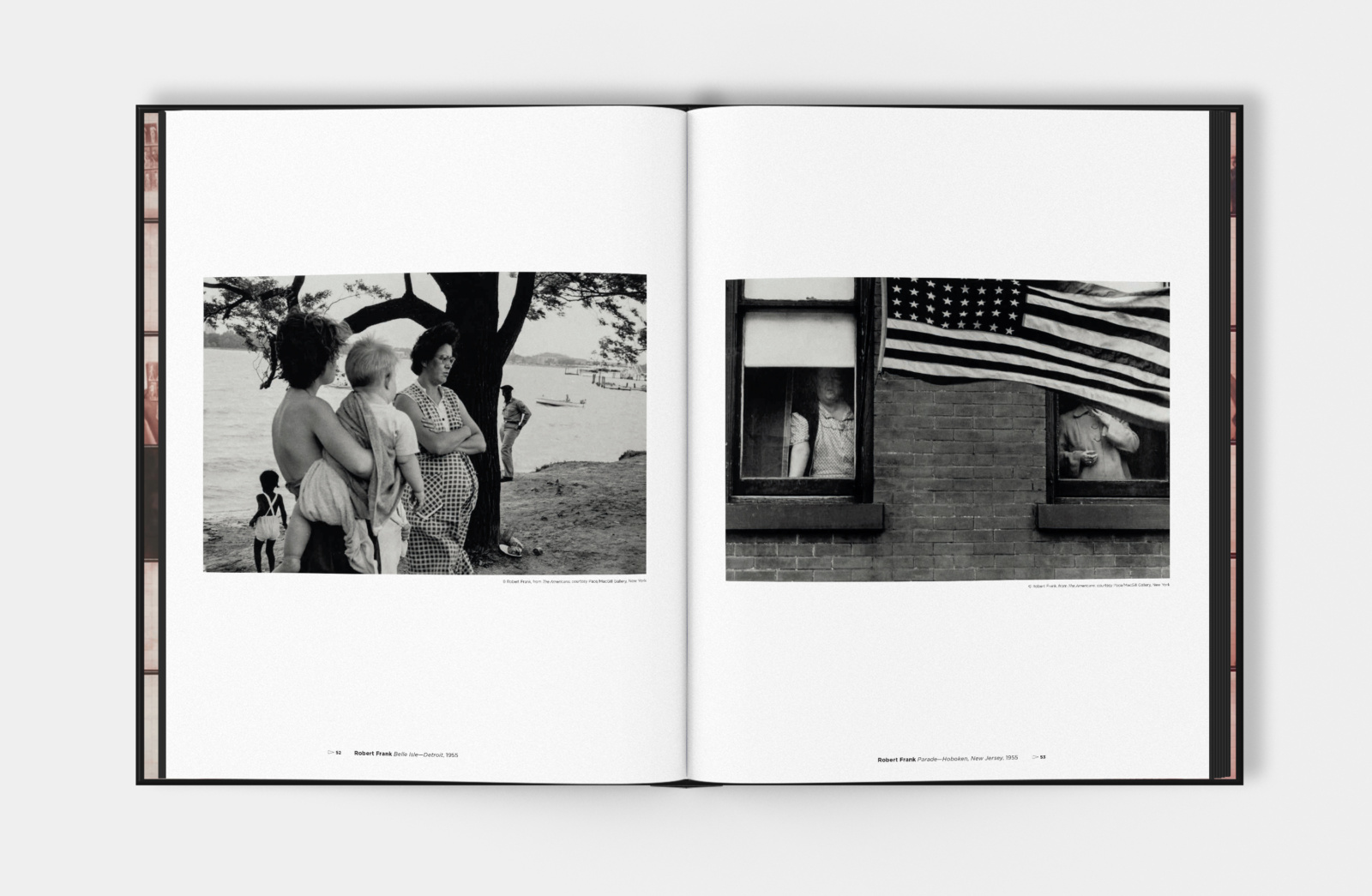
The book begins with full-bleed images of contact sheets that expose the details contained within each sheet, and illustrate the individualistic approach each photographer took to editing and curating images. We honored the black and white contact sheet in its original form—covered in grease pencil markings that map out the artistic process.
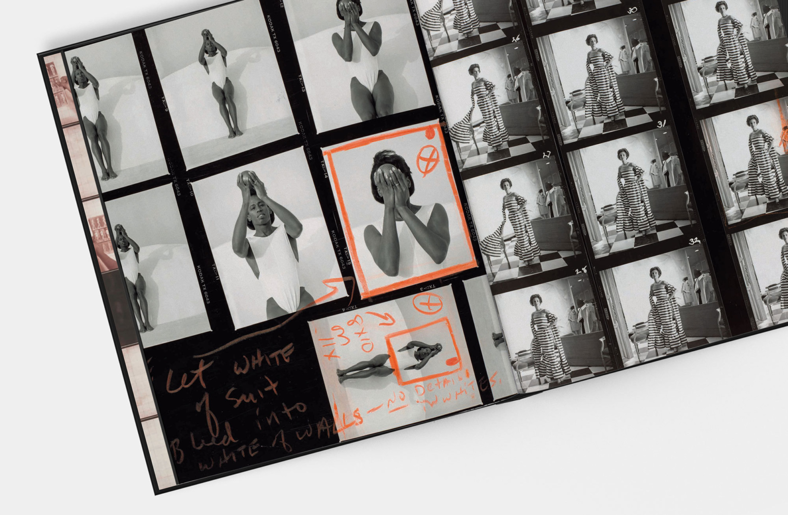
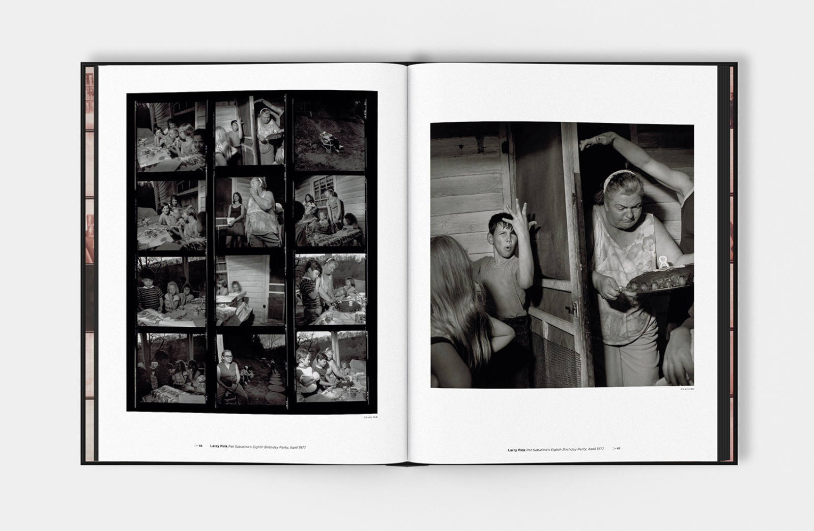
As the book unfolds, our emphasis on clean, open design allows the contact sheets to own the page. Individual prints are balanced against larger spreads that thoughtfully draw the reader through the collection. From start to finish, readers will find themselves leaning in to examine the individual frames of the contact sheets.
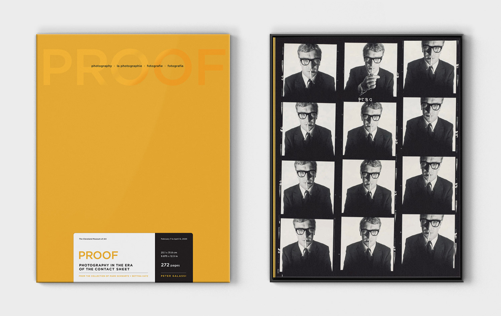
Unlike the standard edition of PROOF, the limited edition comes to the reader in a box designed to evoke the look and feel of iconic photographic paper boxes. The unboxing of the limited edition acts like an uncovering of a stack of contact sheets, which creates a nostalgic tactile experience.
PROOF is not just a catalog of photographs. It’s a scholarly examination, a behind-the-scenes look, a story. PROOF lives at the intersection of fine arts and popular culture, and invites readers of all ages and vocations to engage with twentieth-century photography.
The exhibition closed in November 2020, after a ten-month run at the Cleveland Museum of Art where more than 50,000 people were able to visit and enjoy the collection.
Order the book or learn more about the story behind PROOF.