Prior to this project, the George Gund Foundation had never undergone a formal branding. N+S conducted interviews with the Foundation’s team and collected data that helped to shape our design process. The resulting identity system can exist in a number of styles and mediums, which consistently invoking the daily work the Foundation does to build democracy in Cleveland.
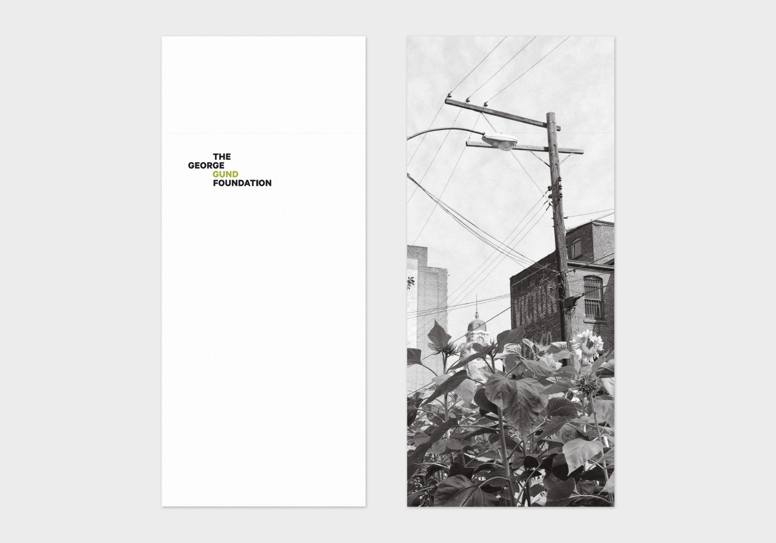
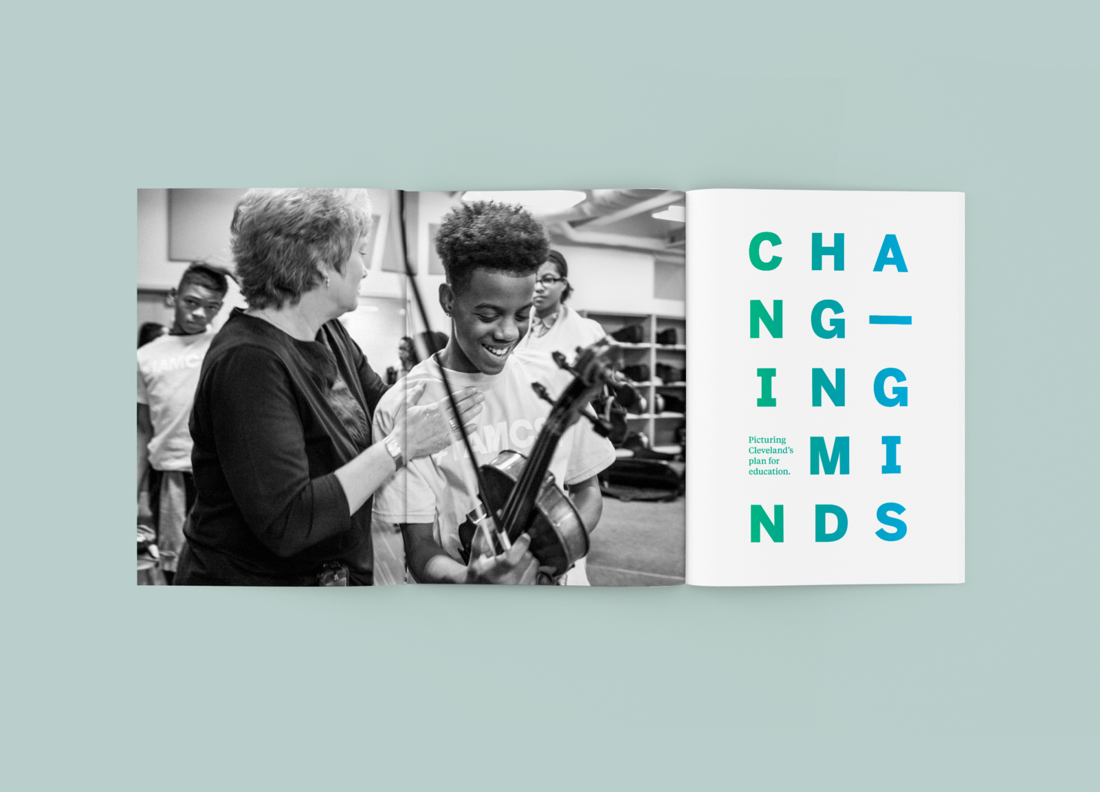
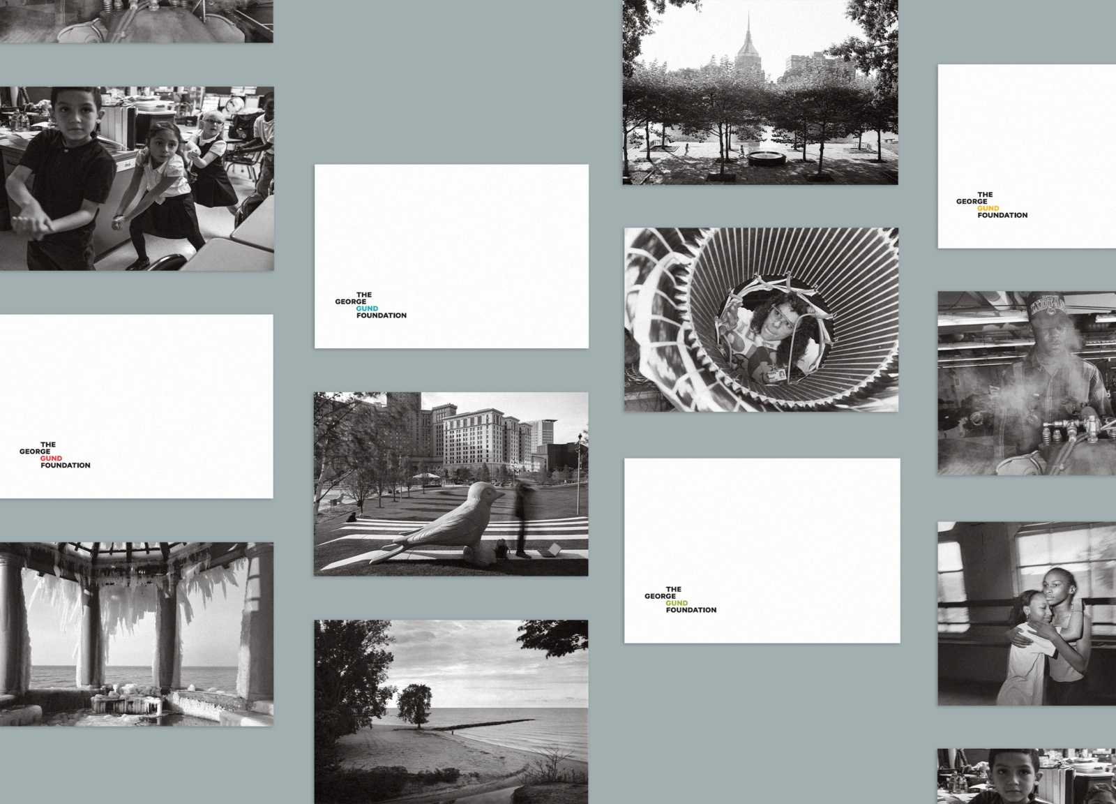
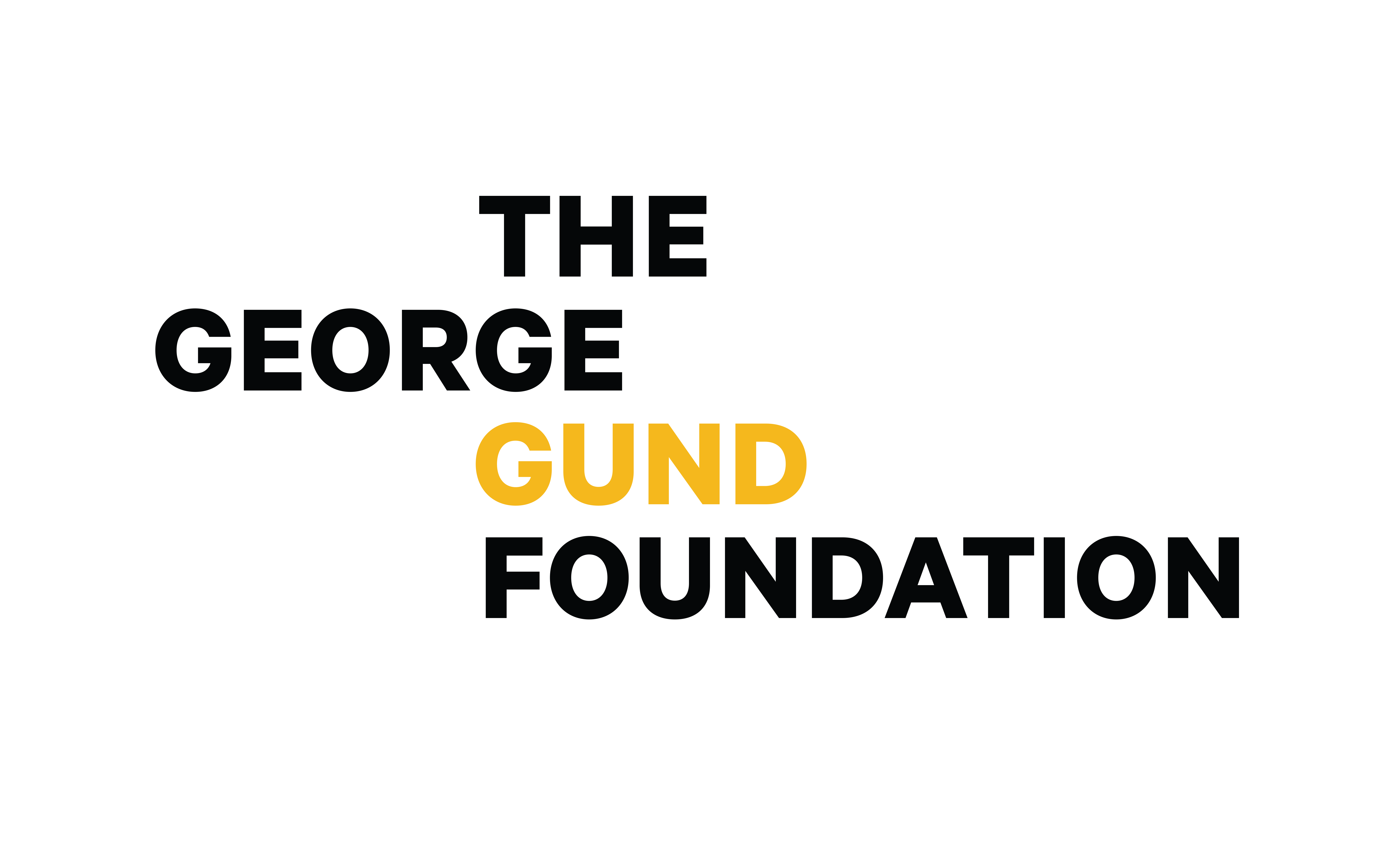
The brand includes bold typography, a contemporary color palette, and a stacked logo design that alludes to the organization’s role in building a stronger community. In addition to the brand identity and business papers, N+S curated images from the Foundation’s photography collection that were incorporated onto the back of the papers. This inclusion highlights the deeply human nature of the Foundation’s work in Greater Cleveland.
The Work
After working with The George Gund Foundation for over thirty years, N+S created a new brand identity for the organization. Prior to this, the Foundation had never undergone a formal branding.
Despite our long-established partnership, we made no assumptions going into the project. Rather, we conducted meetings with the Foundation's team. We asked them to tell us who they were, what their work was about, and why it mattered. We wanted to be reintroduced—and that extra step provided key data that shaped our design process.
The Results
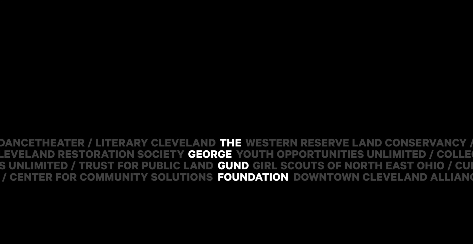
We determined the Foundation required an identity that could exist in a number of styles and mediums, but that still invoked the daily work they do to build democracy in Cleveland.
Our brand design illustrates the Foundation’s role as a key funder in the arts, economic development and community revitalization, education, environment, and human services. Accented by a contemporary color palette and bold typography, the stacked logo design visually suggests how the organization helps to build a stronger community.
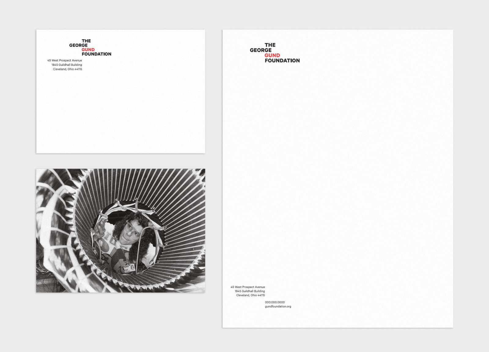
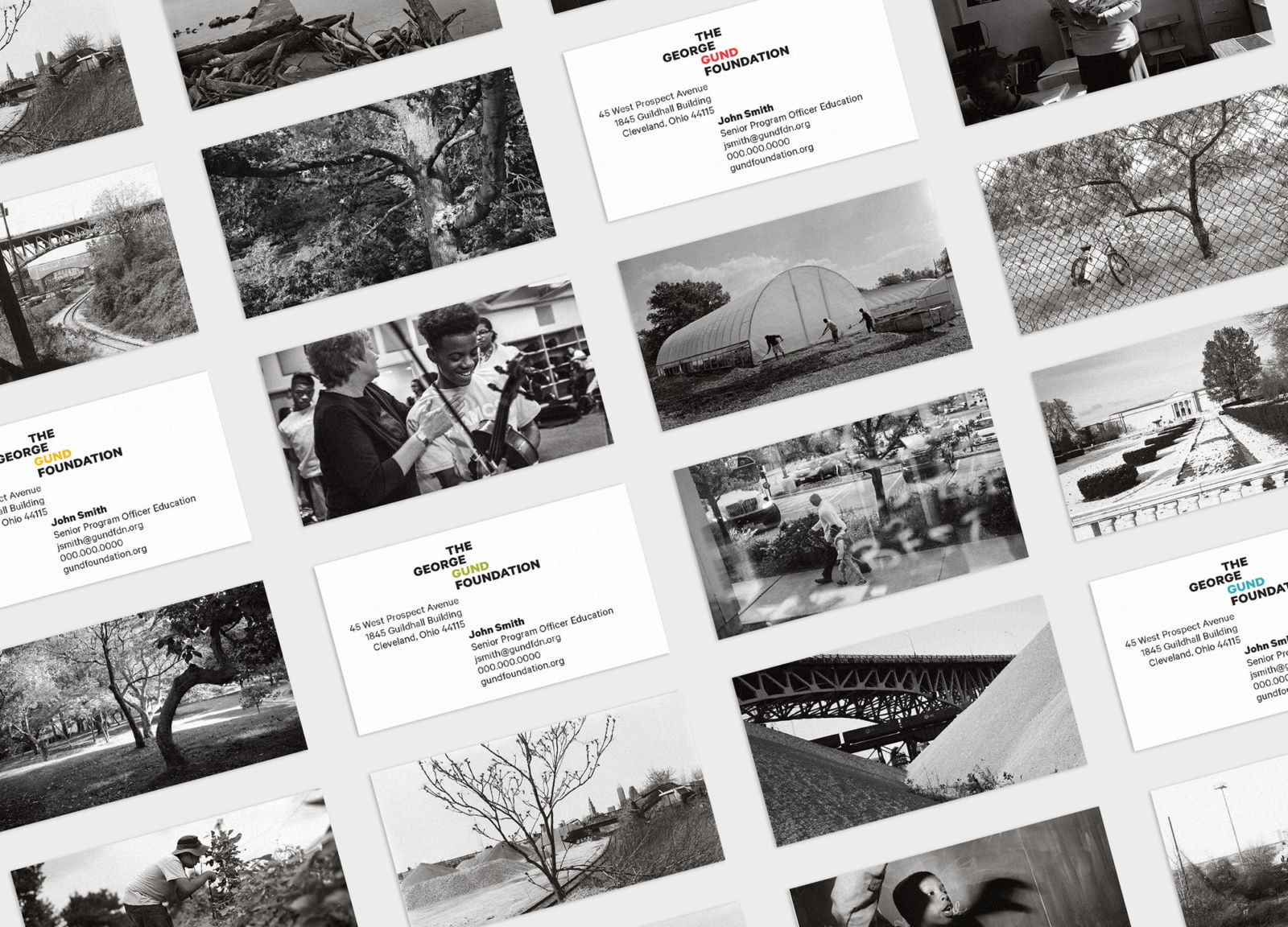
The Foundation's business papers, which include envelopes, letterhead, hang tags, notecards, and business cards, were styled to echo the movement within the logo. Additionally, we curated images from the Foundation’s photography collection on the back of the papers. This design allowed us to fully incorporate the photography into the brand. It reinforced the Foundation’s history as well as the deeply human nature of their work in Cleveland communities.